Some feedback from our end-of-the-year Advisory Council meeting came in the form of “I didn’t know all of the great things you were doing!” especially from parents and teachers. I realized we needed to start doing a better job of collecting, compiling, and sharing data that showed all of the great things our school counseling program was already doing for our high school students, parents, and, really, all of our stakeholders.
No data is bad data, and data does NOT have to be scary! Don’t let it be!
(Here’s a PD-type presentation for school counselors around this topic… “Technology for Effective Data Collection.“)
I also talked about Piktochart in a previous post and how to display that data in an easy-to-read and visually appealing format. (I’ll also add that Canva is also a fantastic and free resource to use ready-made templates to show off your data.) This free program has been key in displaying data to our advisory council stakeholders, our teachers at the beginning of the year, our entire staff during faculty meetings, and the general public on our website.
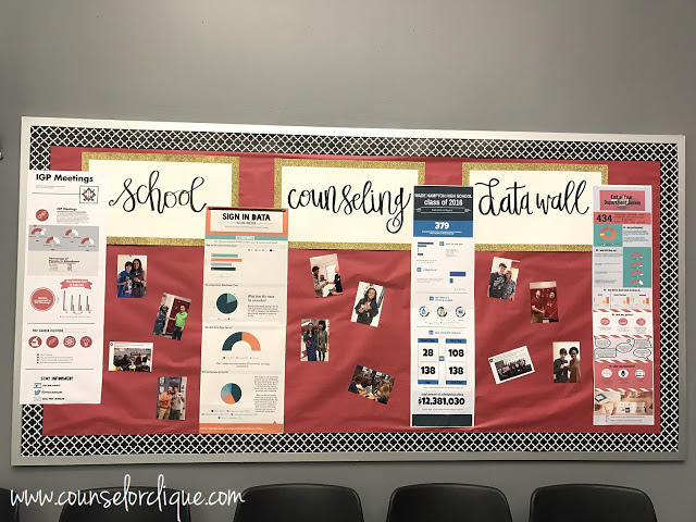
We printed some pretty color copies of our Piktocharts and slapped some pictures up to make it personal. Voila! A visually appealing representation of our data driven programming! We are proud of what we are doing, and we want stakeholders to see that and celebrate it with us!
Wondering what those Piktocharts say?
Close up from L to R:
IGP Meetings
Sign In Data
Class of 2016
End-of-Year Department Survey
Snag a freebie TODAY when you sign up for my email list PLUS stick around for more tips, tricks, and free stuff with Counselor Clique!


